Submitted about 1 year ago
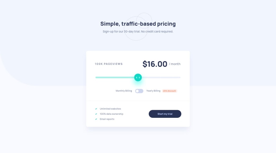
Interactive pricing component built with React
@elyyyse
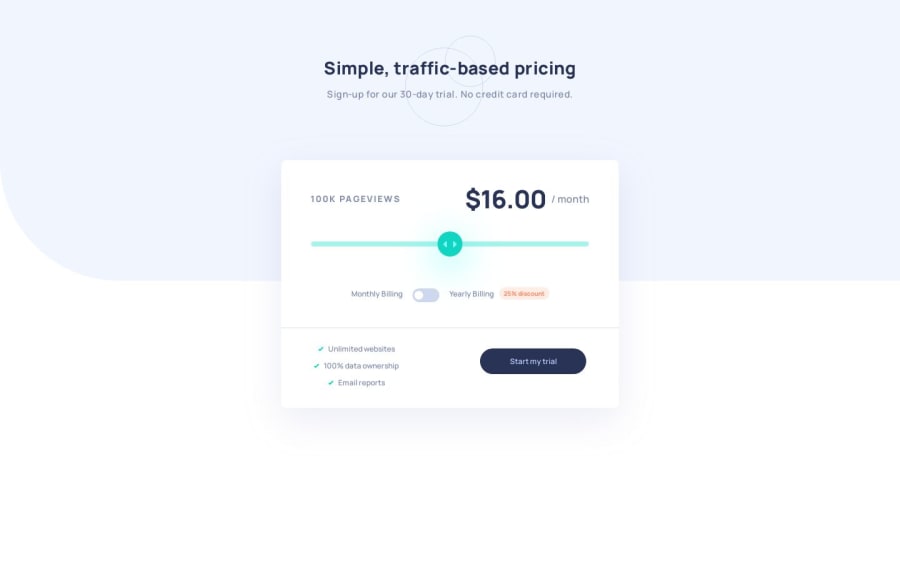
Design comparison
SolutionDesign
Solution retrospective
This is my first React project! ✨ I used Vite to get up and running quickly, but I plan to learn Next.js...next.
Some things I focused on:
- Separating concerns and building reusable components - this was probably overkill for a project of this size, but it was good practice for me
- Both the CTA button and the Monthly/Yearly toggle are built with the same
<Button />component. Figuring this out made me understand React better, but may have created some accessibility concerns.
Some things I want to do next time:
- Implement something like CSS Modules or styled-components - I stuck with plain CSS this time just to minimize how many new things I'm learning at once, but I'm sure these tools will make life easier in the future.
- Continue to improve my component design and get more familiar with React in general
Something I never figured out:
- When styling the
<range>input - I learned that Chrome doesn't support separate track styles for the left and right sides of the thumb (both Firefox and IE do). I found one potential solution, but it seemed a bit hacky, so I decided to leave it alone.
Community feedback
Please log in to post a comment
Log in with GitHubJoin our Discord community
Join thousands of Frontend Mentor community members taking the challenges, sharing resources, helping each other, and chatting about all things front-end!
Join our Discord

