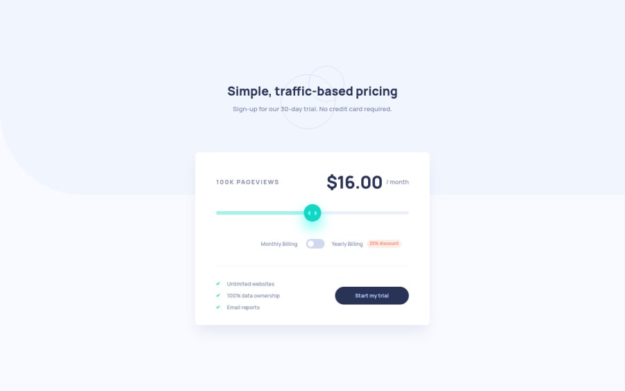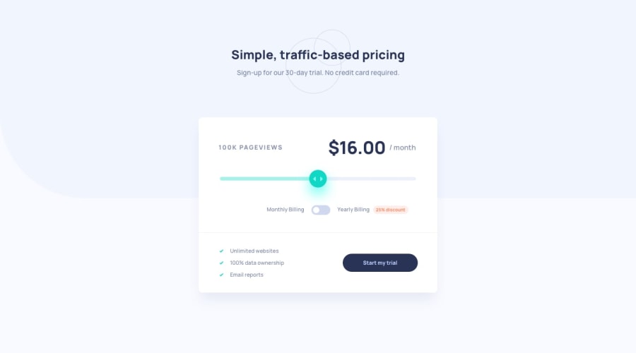
Design comparison
Solution retrospective
Any feedback will be appreciated. Also I would love to hear your way of placing the main background shape so that the edge rounding is not distorted.
Community feedback
- @jpal91Posted over 2 years ago
Awesome job, looks super clean and I really loved the slider animation you added.
Not sure what you meant with the background being blurred, though. It looked fine on my side, but I may be misunderstanding there.
Feel free to ignore this next bit, because it isn't really necessary but I just like buttons to "do" something. I wrote a few extra lines to make the
Start my trialbutton more reactive -Added to main.css
.start {
  ...
  transform: scale(1);
  transition: 0.2s ease-in;
}

.start:hover {
  ...
  cursor: pointer;
  transform: scale(1.05);
  transition: 0.2s ease-in;
}

.bounce {
  animation: 0.5s ease 0s 1 normal forwards bouncebtn;
}

@keyframes bouncebtn {
  0% {
    transform: scale(1.05);
  }

  50% {
    transform: scale(0.9);
  }

  100% {
    transform: scale(1);
  }
}
Added to script.js
const button = document.getElementById("submit-btn");

button.addEventListener("click", (e) => {
  e.preventDefault();
  button.classList.add("bounce");
  setTimeout(() => button.classList.remove("bounce"), 1000);
});
Added to index.html
<button id="submit-btn" class="start" type="button">
//same button, just with added id
I don't usually mess with vanilla CSS too much, but this ended up looking pretty cool so I wanted to share!
0
Please log in to post a comment
Log in with GitHubJoin our Discord community
Join thousands of Frontend Mentor community members taking the challenges, sharing resources, helping each other, and chatting about all things front-end!
Join our Discord
