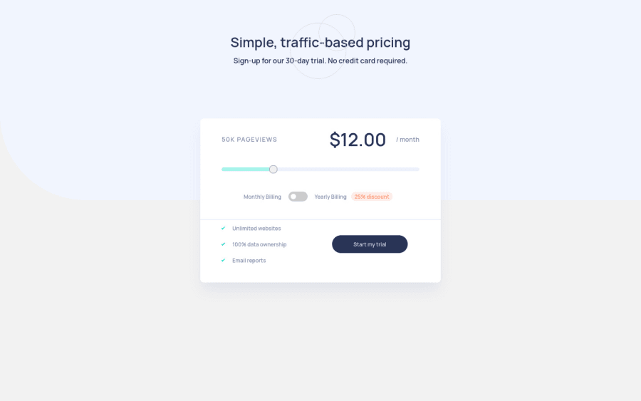
Interactive Pricing Component - using Tailwind CSS & Vanilla JS
Design comparison
Solution retrospective
This is another project that I completed using Tailwind CSS and Vanilla JS. I should admit that this was quite a challenge for me, especially the Javascript part since Javascript isn't my strongest point yet. Any feedback will be appreciated.
Community feedback
- @grace-snowPosted over 2 years ago
Hi
I noticed a few issues
- inline svgs need to be aria-hidden true and focusable false
- the decorative svg is overlapping the heading
- output is not a html element
- you can’t have multiple h2s for the same (or no) content.
- text that should be read together needs to be in the same meaningful element. Remember text should never be in divs or spans alone
- wrapping a form element in a label doesn’t label it unless there is text in it
- I recommend using radios not a checkbox for the toggle . There are two distinct states and two clear visible labels so it makes much more sense. This is not accessible at the moment as it’s unclear what the checked/unchecked states equate to
- why is start my trial a button? What would you expect to happen on click?
Overall, make sure you test this with keyboard and screenreader: the hardest thing about the challenge is making sure the content is understandable and useable by all users. I’d expect this to need some extra aria attributes
0
Please log in to post a comment
Log in with GitHubJoin our Discord community
Join thousands of Frontend Mentor community members taking the challenges, sharing resources, helping each other, and chatting about all things front-end!
Join our Discord
