Design comparison
Solution retrospective
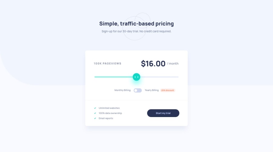
Just completed another challenge, this was my first time working with range type input. It was challenging and my code is a little messy, any feedback would be highly appreciated.
Community feedback
- @AgataLiberskaPosted over 3 years ago
Hi @LuyoloLuja :) make sure to check the accessibility report - it looks like you need to add aria-labels to your inputs. Also, make sure to replace the focus outline with some other styles, if you really don't like it.
I'm also not sure about separating the heading text into a whole separate header - I think it makes more sense for the whole component to be one section. Header would contain introductory info to a whole page, things like brand logo, nav etc.
Hope this helps :)
0@LuyoloLujaPosted over 3 years agoHi @AgataLiberska thanks for the feedback, I will definitely work on it
0@AgataLiberskaPosted over 3 years ago@LuyoloLuja actually, I decided to look into that
<header>issue and I think I was wrong there, according to this article on sectioning elements, so we both learnt something today :D0@LuyoloLujaPosted over 3 years ago@AgataLiberska lol yeah I guess and I thought it was for the top of the page only. At the back of my mind I thought you might be mistaken but I wasn't 100%, I try as much as I can to follow good practices.
0@AgataLiberskaPosted over 3 years ago@LuyoloLuja yeah, when you look up the header itself, that's how I understood it as well. But that's why I like checking and commenting on other people's solutions - I probably wouldn't think about looking this up if I hadn't commented here :)
0@LuyoloLujaPosted over 3 years ago@AgataLiberska it's a never ending learning journey, I appreciate people like you✌️
0
Please log in to post a comment
Log in with GitHubJoin our Discord community
Join thousands of Frontend Mentor community members taking the challenges, sharing resources, helping each other, and chatting about all things front-end!
Join our Discord
