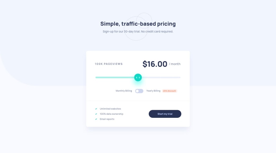
Design comparison
SolutionDesign
Solution retrospective
Hello everyone!!
I had some troubles with custom toggle.
Any comments are welcome!
Community feedback
- @j-0-n-e-zPosted over 1 year ago
Hi! Congratulations on completing this project, I noticed something. If you stick to the design, your toggle button should be more in the center. Hope it would help.
0@AlexKolykhalovPosted over 1 year agoHi, @j-0-n-e-z, yes, you're right! But I thought my solution does not break the symmetry)) Discount part will go too far to the right in design version.
But thank you for notice!
0
Please log in to post a comment
Log in with GitHubJoin our Discord community
Join thousands of Frontend Mentor community members taking the challenges, sharing resources, helping each other, and chatting about all things front-end!
Join our Discord
