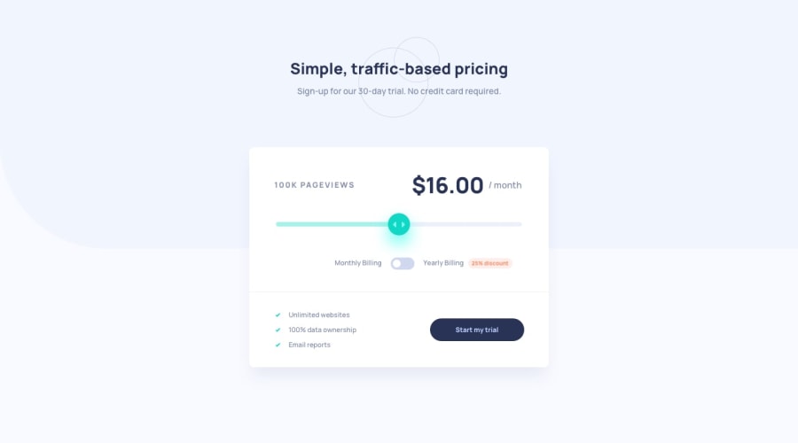
Design comparison
SolutionDesign
Solution retrospective
I had fun completing this challenge, some of the things I found difficult:
- Toggle switch: I wasn't able to successfully flip the toggle switch, but will soon update that.
- Responsive Design: I took a mobile first approach so didn't get a chance to modify the font sizes and component widths for a desktop screen.
Please let me know if there's anything I can improve, I would love to hear your feedback
Community feedback
Please log in to post a comment
Log in with GitHubJoin our Discord community
Join thousands of Frontend Mentor community members taking the challenges, sharing resources, helping each other, and chatting about all things front-end!
Join our Discord
