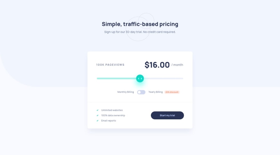
Design comparison
Solution retrospective
I think the layout if I started via mobile-first would have saved me time and frustration, but it's a learning process so it's alright. I also think the javascript could have been better but I learned a few things while doing it like this, the not so straight-ahead way so I think it was alright too.
Feedback is always welcome.
Community feedback
- @kenjimaeda54Posted over 3 years ago
Nice bro. I didn't like my result I tried to use material ui
1 - @aasthaanand123Posted over 3 years ago
Hey, good work! But when toggled to yearly billing the price does not switch to "/year", so you might want to check that out. Happy coding!
1@YuniacPosted over 3 years ago@aasthaanand123 Oh, I didn't even notice, will edit it! thank you.
0@aasthaanand123Posted over 3 years ago@Yuniac And also the range input bar is a bit problematic in terms of changing color when dragged.(it should only fill the color till the point its dragged)
0@YuniacPosted over 3 years ago@aasthaanand123 What browser? and what is the problem exactly? Right now in chrome/edge it only has a color when focused/being dragged. On firefox, it works just fine from what I can tell.
0@aasthaanand123Posted over 3 years ago@Yuniac actually it should not fill the whole bar only till the point till its dragged.
0@YuniacPosted over 3 years ago@aasthaanand123 Yes, on Firefox it is the case but one chrome/edge it's not, unfortunately. However, I will change it soon, thanks for letting me know
0 - @tedikoPosted over 3 years ago
Hello, Rael! 👋
Well done on this challenge! Your solution responds well. I would suggest you to add
:focuspseudo class to interactive elements like buttons and input just to know keyboard users where they are on the page and what behaviour they can expect. Useoutlineproperty to make your website more accessible to keyboard users. Focusable elements like anchor, buttons or inputs they have applied default:focuspseudo class withoutlineproperty. These default styles are subtle and hardly visible tho. Furthermore every browser has a slightly different default style for the outline, so you probably want to change the default style. Read more about why we should change focus styles.Good luck with that, have fun coding! 💪
1@YuniacPosted over 3 years ago@tediko Thank you, will try to implement those features in this project and always in the future.
0
Please log in to post a comment
Log in with GitHubJoin our Discord community
Join thousands of Frontend Mentor community members taking the challenges, sharing resources, helping each other, and chatting about all things front-end!
Join our Discord
