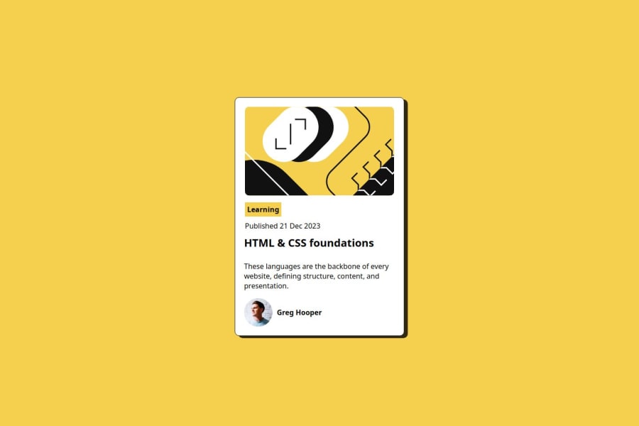
Design comparison
Solution retrospective
Unlike my first project, I was able to quickly understand the problem and plan out the solution, and then tackle each small step at a time.
What challenges did you encounter, and how did you overcome them?I was getting stuck on the alignment of content in the box container. There were so many terms, such as justify-content, align-items, align-content, and etc. I was confused about how to apply those properties. I googled online and found a great introduction of Flexbox. I read and summarized the info on the page, and then implement the knowledge to my design. This learning process gave me confidence about the use of Flexbox in the future.
What specific areas of your project would you like help with?I really want to get a better idea of how to apply semantic HTML tags in various design situations. In this project, I was not sure how to name the various sections, or what semantic tags is more meaningful. For example, the design started with a svg file and there are two lines of text below the image. I was not sure whether I should place the whole thing under or how to name the specific section.
Join our Discord community
Join thousands of Frontend Mentor community members taking the challenges, sharing resources, helping each other, and chatting about all things front-end!
Join our Discord
