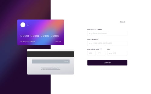
Submitted over 1 year agoA solution to the Interactive card details form challenge
Interactive Online Banking Card(with Luhn Algorithm)
react, vite
@VictorKevz

Solution retrospective
What are you most proud of, and what would you do differently next time?
😊It turns out there was actually a lot of stuff to consider on the validation of the form!
I ended up learning about the Luhn Algorithm that's actually used to validate a 16-digit credit/debit card and this was quite insightful😁 as my form now verifies only real 16-digit credit/debit card numbers. I also added the button to reset the form
What I missed on this project was;
- figuring out a way to automatically format the card number, (space after every 4 digits in the input field)
- Conditionally rendering error messages relevant to the cause of the error (design only showed Can't be blank for other fields when empty but what if the CVC has 4 digits or year/month entered is invalid?
I still haven't added the responsiveness to the smallest screen sizes (was a bit lazy🤣)
Code
Loading...
Please log in to post a comment
Log in with GitHubCommunity feedback
No feedback yet. Be the first to give feedback on Victor's solution.
Join our Discord community
Join thousands of Frontend Mentor community members taking the challenges, sharing resources, helping each other, and chatting about all things front-end!
Join our Discord