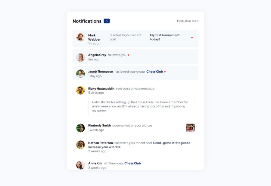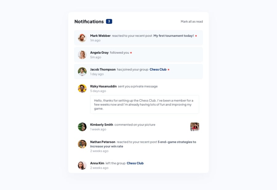
Design comparison
SolutionDesign
Solution retrospective
What are you most proud of, and what would you do differently next time?
It's quite strange how the design-solution comparison looks because my solution looks different 😂 but anyways: What I Learned
-
HTML & CSS:
- Structuring HTML5 for dynamic content.
- Styling with CSS3 for responsive and visually appealing layouts.
- Implementing hover and focus states for better user experience.
-
JavaScript & React:
- Managing state with React hooks.
- Dynamically rendering components for scalability and maintainability.
- Using Vite for a fast development environment.
-
Responsive Design:
- Creating layouts that adapt to various screen sizes.
- Ensuring optimal viewing on mobile, tablet, and desktop devices.
-
Interactivity:
- Toggling visual states of notifications using JavaScript.
- Implementing Mark all as read functionality.
This project provided a comprehensive exercise in building a functional and responsive notifications page, enhancing my skills in front-end development and modern web technologies.
Community feedback
Please log in to post a comment
Log in with GitHubJoin our Discord community
Join thousands of Frontend Mentor community members taking the challenges, sharing resources, helping each other, and chatting about all things front-end!
Join our Discord
