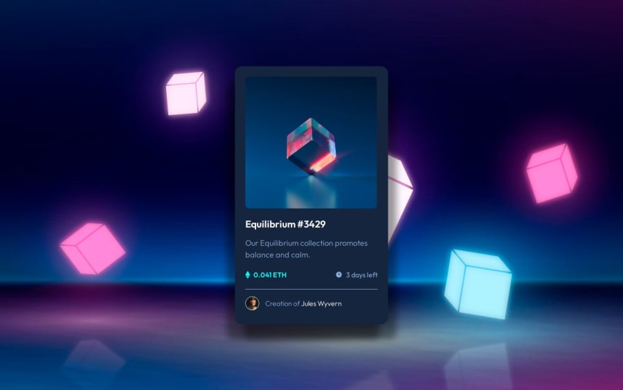
Interactive NFT Card (html, LESS, .json, js, mobile-first workflow)
Design comparison
Solution retrospective
I utilized a JSON file for this project, making the NFT card super versatile and ready for any occasion! 🎉 Now it can be reused without breaking a sweat—talk about a card that works smarter, not harder! 😄 Who knew JSON could be so fabulous?
What challenges did you encounter, and how did you overcome them?Due to my limited experience, I found myself rewriting and tweaking the script for creating HTML `` several times. But hey, every misstep is just a step towards mastery! Now I have a much clearer understanding of how it all works—watch out world, I’m leveling up! 🚀
What specific areas of your project would you like help with?I've been wondering whether :hover effects are really necessary for mobile devices, especially after finishing the project. It only hit me after completing everything, but I think next time I might avoid adding hover effects for the mobile version altogether. What do you think?
Community feedback
- @Axsel519Posted 6 months ago
i think in hover better because it makes the user feel like they are interacting with the site. and good work
1
Please log in to post a comment
Log in with GitHubJoin our Discord community
Join thousands of Frontend Mentor community members taking the challenges, sharing resources, helping each other, and chatting about all things front-end!
Join our Discord
