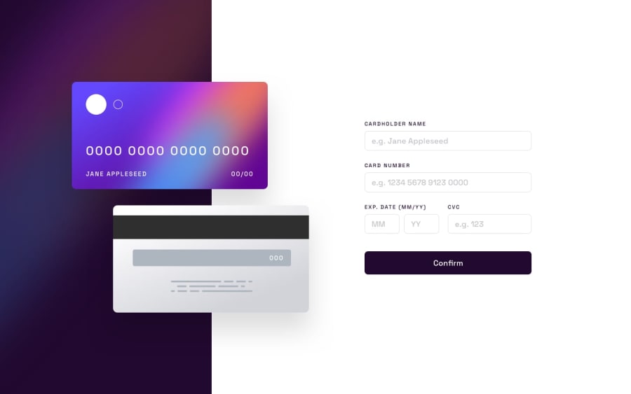
Design comparison
Solution retrospective
I am most proud of the responsiveness of the credit cards.
Next time, I would spend more time learning about the position property in CSS as this would have cut down time in getting the credit cards hovering over the background.
What challenges did you encounter, and how did you overcome them?The floating credit cards were the biggest challenge and took the longest time to implement because I had trouble conceptualizing how to allow them to be responsive and hover on top of each other in a static way.
I overcame the problem by researching how to use the position property and lots of experimentation with the Chrome dev tools using different CSS properties to get the floating cards how they were shown in the mockups.
What specific areas of your project would you like help with?I'd really like to know if there's a better or easier way to implement the cards than the way I did.
Also, I'm open to any feedback!
Community feedback
Please log in to post a comment
Log in with GitHubJoin our Discord community
Join thousands of Frontend Mentor community members taking the challenges, sharing resources, helping each other, and chatting about all things front-end!
Join our Discord
