Design comparison
Solution retrospective
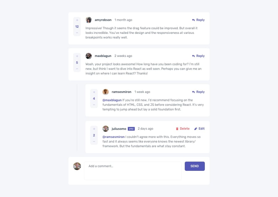
This project was pretty challenging! Harder than the other two intermediate challenges I've done (one submitted, other is the product page but that I will submit as a larger e-commerce app). It looks like a pretty basic CRUD app at face value, but there are lots of small interactions and ways to organize and pull out the data that make it a bit of an 'iceberg' :)
Redux is not the simplest thing in the world, but I really think I've grown a lot with just this project. Next up, I plan on building with a framework (Remix or Next), Typescript, and implementing tests.
Do you have any suggestions or feedback? Is there a better way to implement responsiveness or anything I did with styling? Would you have organized things differently in the redux slices/actions?
Community feedback
- @0xabdulkhaliqPosted over 1 year ago
Hello there 👋. Congratulations on successfully completing the challenge! 🎉
- I have other recommendations regarding your code that I believe will be of great interest to you.
HTML 🏷️:
- This solution generates accessibility error reports due to
non-semantic
markup, which lack landmark for a webpage
- So fix it by replacing the element
<div id="root">
the with semantic element<main>
in yourindex.html
file to improve accessibility and organization of your page.
- What is meant by landmark ?, They used to define major sections of your page instead of relying on generic elements like
<div>
or<span>
- They convey the structure of your page. For example, the
<main>
element should include all content directly related to the page's main idea, so there should only be one per page
HEADINGS ⚠️:
- And, this solution has also generated accessibility error report due to lack of level-one heading
<h1>
- Every site must want at least one
h1
element identifying and describing the main content of the page.
- An
h1
heading provides an important navigation point for users of assistive technologies, allowing them to easily find the main content of the page.
- So we want to add a level-one heading to improve accessibility by reading aloud the heading by screen readers, you can achieve this by adding a
sr-only
class to hide it from visual users (it will be useful for visually impaired users)
LABELS 🔖:
input
elements wants alabel
associated with it
- A
<label>
is used to create a caption for a form control. The<label>
can be associated with a form control either implicitly by placing the control element inside the label element, or explicitly by using the for attribute
- Effective form
labels
are required to make forms accessible. The purpose ofform
elements such ascheckboxes
,radio
buttons,input
fields, etc, is often apparent to sighted users
- Even if the
form
element is not programmatically labeled. Screen readers users require useful formlabels
to identifyform
fields.
I hope you find this helpful 😄 Above all, the solution you submitted is great !
Happy coding!
Marked as helpful0
Please log in to post a comment
Log in with GitHubJoin our Discord community
Join thousands of Frontend Mentor community members taking the challenges, sharing resources, helping each other, and chatting about all things front-end!
Join our Discord