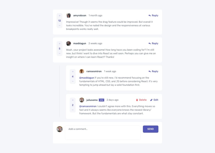
Design comparison
SolutionDesign
Community feedback
- @denieldenPosted over 2 years ago
Hi Haikal, good job! I took some time to look at your code and have some ideas for improving it:
- use
imgelement and not a div withprofile-picclass for the user image - i can comment also with empty comment or with blanks, add a control... The
trim()method can help you -> read here - instead of using
pxtry to use relative units of measurement -> read here
Overall you did well 😉
Hope this help and happy coding!
0 - use
Please log in to post a comment
Log in with GitHubJoin our Discord community
Join thousands of Frontend Mentor community members taking the challenges, sharing resources, helping each other, and chatting about all things front-end!
Join our Discord
