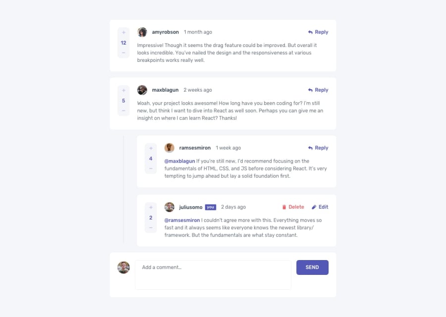
Design comparison
Solution retrospective
This project was probably the most challenging one to date on this site. I grew a lot in my understanding of javascript and was able to practice with some tools. Mainly localstorage, findIndexOf etc. I found myself having to refactor the code several times. The look was correct, but the logic forced me to change the look, then the logic was incorrect after adjusting the look. My mistake was making a gameplan solely based on the mobile design. Instead I need to make a plan with the entire design in mind so I can account for those changes that occur at larger widths. I did not complete all of the active state pieces for this reason.
Community feedback
Please log in to post a comment
Log in with GitHubJoin our Discord community
Join thousands of Frontend Mentor community members taking the challenges, sharing resources, helping each other, and chatting about all things front-end!
Join our Discord
