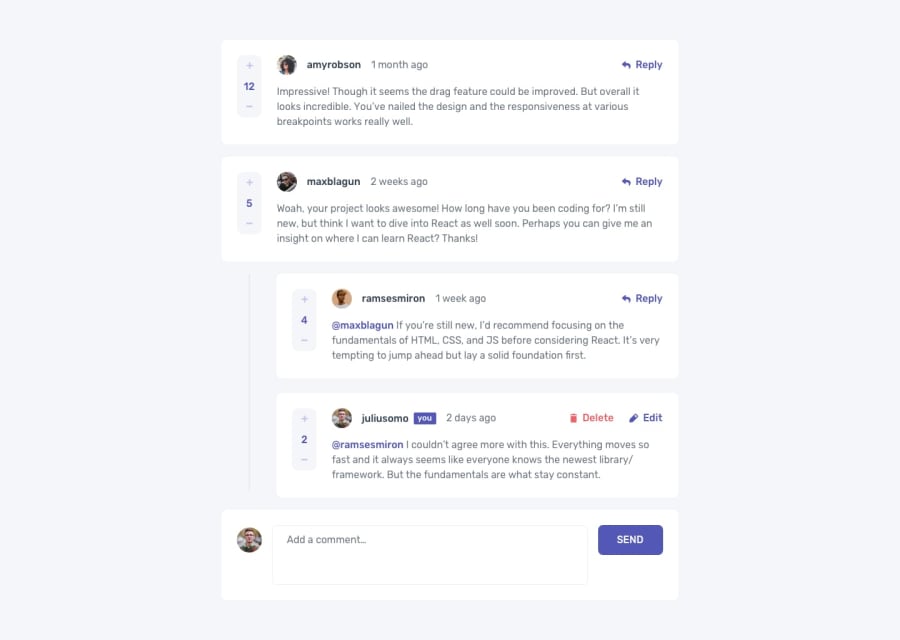
Design comparison
SolutionDesign
Solution retrospective
Been a long time here, over 7months!
I need reviews and comments. Would go a long way.
Community feedback
- @thevolcanomanisherePosted over 2 years ago
Looks great! You just need to add a border radius to the 'you' with the blue background. Also your font has very tight kerning. Check it out here -> https://developer.mozilla.org/en-US/docs/Web/CSS/font-kerning
Check out tailwind for CSS. You will move 5x quicker and can write your css on the components directly
Marked as helpful0
Please log in to post a comment
Log in with GitHubJoin our Discord community
Join thousands of Frontend Mentor community members taking the challenges, sharing resources, helping each other, and chatting about all things front-end!
Join our Discord
