Not Found
Not Found
Not Found
Not Found
Not Found
Not Found
Not Found
Not Found
Not Found
Not Found
Not Found
Not Found
Not Found
Not Found
Not Found
Not Found
Not Found
Not Found
Not Found
Not Found

Submitted

Interactive comments section - plain vanilla CSS and JS

@Richard2957

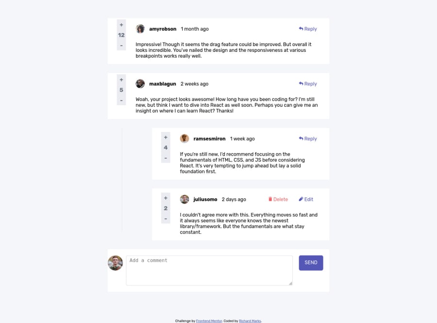
Desktop design screenshot for the Interactive comments section coding challenge

This is a solution for...

  • HTML
  • CSS
  • JS
3intermediate
View challenge

Design comparison


SolutionDesign

Solution retrospective


Pleased to finish this. The javascript took much longer than I had expected,

Community feedback

Ivan 2,630

@isprutfromua

Posted

Hi there. You did a good job 😎

keep improving your programming skills🛠️

your solution looks great, however, if you want to improve it, you can follow these recommendation:

				**HTML**

Use HTML5 semantic elements. Make sure correct use of the HTML5 semantic elements like: header, footer, main, nav, article, section. It’s will help you to write more structured piece of code.

Avoid complex wrapping. For better performance please tried to avoid unnecessary wrapping. It will create unnecessary node in your HTML tree and reduce performance too.

<div class="mymodal">
<div class="mymodalbox">
<h2>Delete comment</h2>
Are you sure you want to delete this? This cannot be undone.
<div class="modalbuttons">
  <div class="modalbuttonno">NO, CANCEL</div>
  <div class="modalbuttondelete">YES, DELETE</div>
</div>
</div>
</div>
</div>

Write Code Comments. It’s best practice to write human-readable code. Tried to comment your block of code. It will help you or any other developer to refactor the piece of code blocks.

Use only one <h1> element for one code sheet. It is important to avoid using more than one <h1> element for one code sheet. Having only one <h1> element on a web page is vital for Search Engine Optimization (SEO). It helps search engines understand what a web page is all about (the main idea of a web page).

Do not skip heading levels in HTML. Don't use <h1> and then jump to <h3> when using header tags. It's difficult for web visitors using a screen reader to understand the contents of your web page when you skip heading levels.

Do not use divs to create headers and footers – use semantic elements instead. It's advisable to use the <figure> element when adding captions to your images. It is important to use the <figcaption> element along with the <figure> element for it to work.

Follow a consistent HTML format. It is important to remain consistent in your HTML style. You can use prettier to help you with that but the goal is to always follow a consistent way you code your markup.

<div class="mymodal">
<div class="mymodalbox">
<h2>Delete comment</h2>
Are you sure you want to delete this? This cannot be undone.
<div class="modalbuttons">
  <div class="modalbuttonno">NO, CANCEL</div>
  <div class="modalbuttondelete">YES, DELETE</div>
</div>
</div>
</div>
</div>
				**CSS**

Use a CSS reset . By default, browsers don’t apply the same default styling to HTML elements, a CSS reset will ensure that all element have no particular style. For example: css-reset

Write consistent CSS. At the beginning part of the project you can set some rules for maintain throughout to your entire stylesheet. If you follow the convention or BEM, you’ll be able to write CSS without being afraid of side effects.

Use rem’s or em’s. Using rem’s or em’s is more dynamic way instead of using pixels. Try to use rem’s or em’s rather than pixels.

Use mobile first development approach. A mobile-first approach to styling means that styles are applied first to mobile devices.

Don’t use @import . The @import directive is much slower than the other way to include stylesheets into a html document:

<link rel='stylesheet' type='text/css' href='a.css'>
<link rel='stylesheet' type='text/css' href='font.css'>

Avoid Extra Selectors. Adding extra selectors won't bring Armageddon or anything of the sort, but they do keep your CSS from being as simple and clean as possible.

.getinput > img{
    border-radius: 50%;
    width: 50px;
}
.getinput > textarea{
min-height:100px;
vertical-align: top;
padding:5px 10px 50px 10px;
font-size:16px;
border:2px var(--light-gray) solid;
border-radius:5px;
outline:none;
}

Use Clamp . The clamp function make smaller and simple CSS to control element width.

width: clamp(100px, 50%, 300px);

I hope my feedback will be helpful. You can mark it as useful if so 👍 it is not difficult for you, but I understand that my efforts have been appreciated

Good luck and fun coding 🤝⌨️

0

Please log in to post a comment

Log in with GitHub
Discord logo

Join our Discord community

Join thousands of Frontend Mentor community members taking the challenges, sharing resources, helping each other, and chatting about all things front-end!

Join our Discord