Design comparison
Community feedback
- P@tobaojoPosted 3 months ago
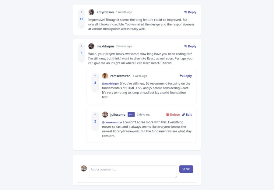
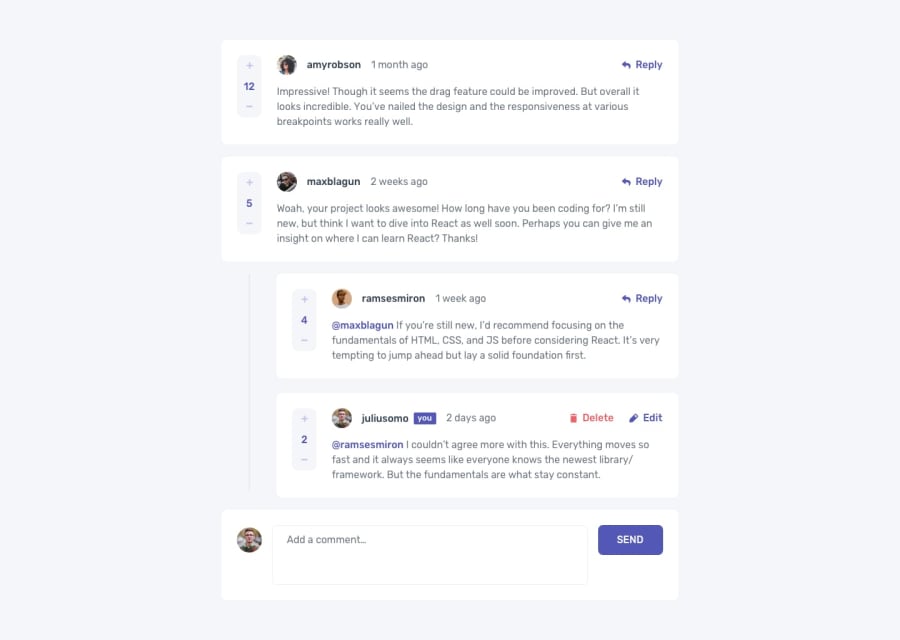
This is a good start. Its layed out really nicely though I think you could make the background grey for the replies. It is also responsive which is cool.
The buttons and smaller attention to detail was well addressed too.
The fact that you managed to do this with plain JS is very impressive and you should be proud.
I think your reply logic is better than mine so I can learn something from you here.
I do appreciate that this task was rather challenging but I do this it is worthwhile to try and get this project looking closer to the original designs if you want? I can see you used tailwind which I also think makes life easier
1
Please log in to post a comment
Log in with GitHubJoin our Discord community
Join thousands of Frontend Mentor community members taking the challenges, sharing resources, helping each other, and chatting about all things front-end!
Join our Discord
