Design comparison
SolutionDesign
Community feedback
- @sumyta12Posted about 1 year ago
you have done your project that great😍 . your UI looking accurate as the challenge show .
I am giving some feedback for improvement.
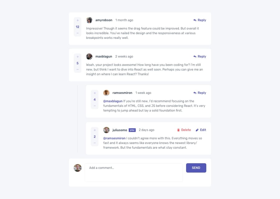
-> here when i am give anyone reply then when it update i can drag and drop the box you need to off that using css.
-> in your last reply the overflow -y is show and in main design they have no overflow in reply
-> and i am little bit confused about your last comment reply already you have shown one reply box when i am clicking again the reply it shown me another box . and also i am not seeing any replies input box
0
Please log in to post a comment
Log in with GitHubJoin our Discord community
Join thousands of Frontend Mentor community members taking the challenges, sharing resources, helping each other, and chatting about all things front-end!
Join our Discord
