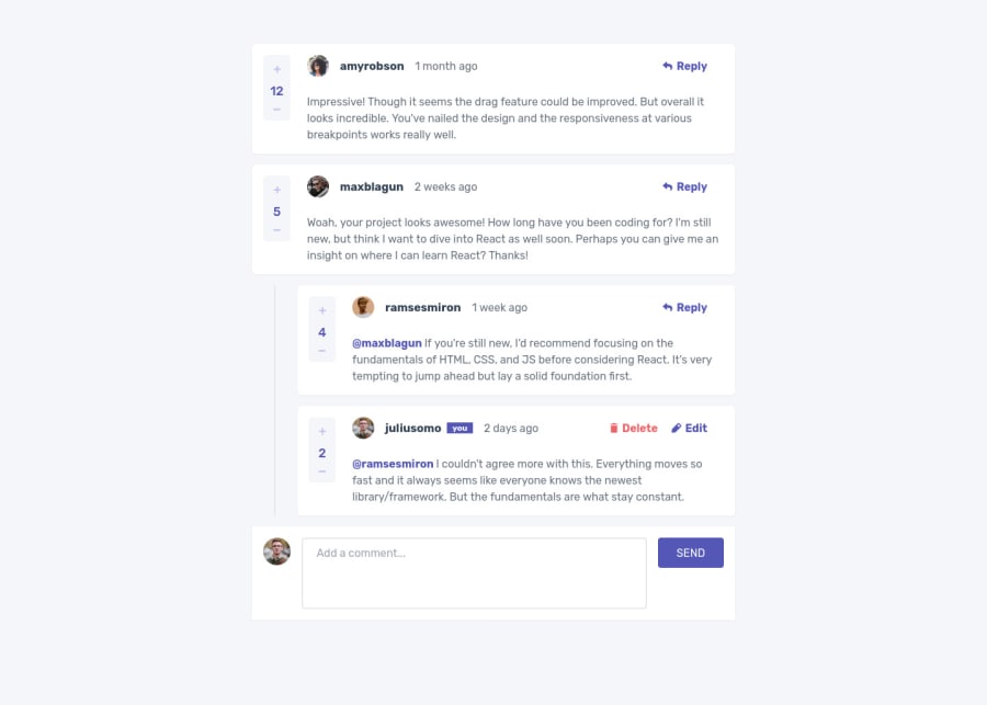
Interactive Comments Section built with React && Redux && TailwindCSS
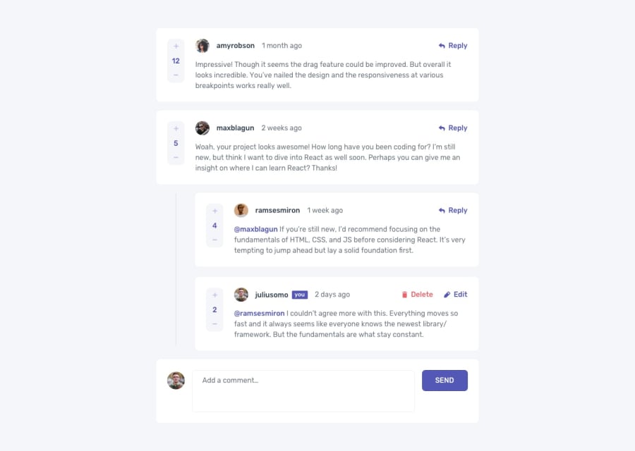
Design comparison
Solution retrospective
This is the hardest challenge I have ever done on this website. I learned not only design but also how to deal with nested objects from this challenge. I'd love it if I get feedback so that I can improve. Thanks to frontendmentor.io for creating this challenge.
Community feedback
- @elroytoscanoPosted almost 3 years ago
You've done a great job with the design and functionality. You can reply, you can add only one like/dislike, however, when you click on the delete button, there needs to be a "pop up", which is a warning to the user regarding deleting the comment. Again, the design is well done, good job 👍.
Marked as helpful1@soewaiyanagPosted almost 3 years ago@elroytoscano Yes, I miss that. And also I just notice that the button is overflowing in firefox. I'm working on that. Thank you. edit - fixed
1
Please log in to post a comment
Log in with GitHubJoin our Discord community
Join thousands of Frontend Mentor community members taking the challenges, sharing resources, helping each other, and chatting about all things front-end!
Join our Discord
