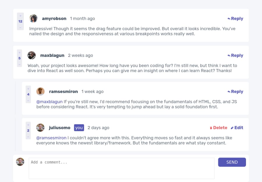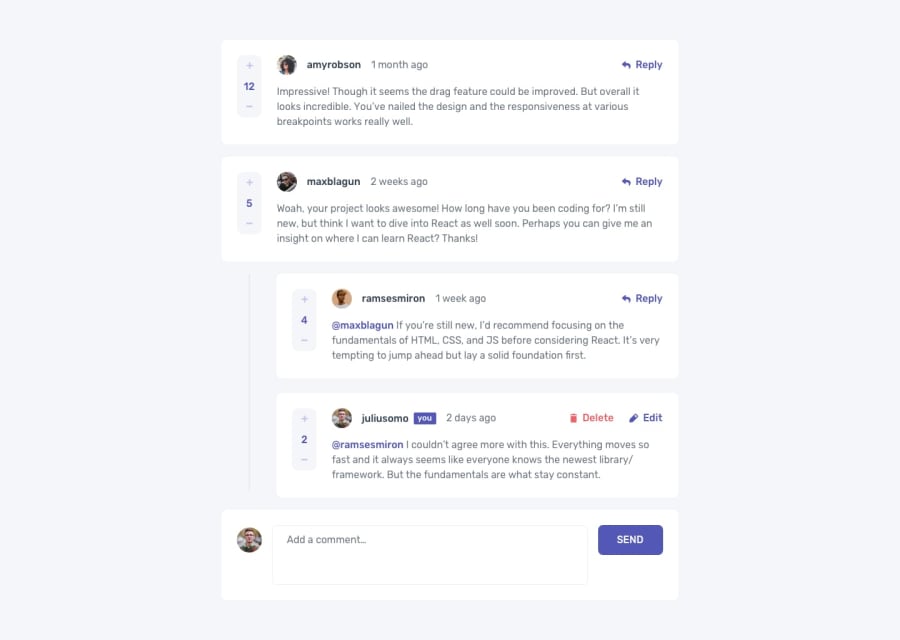
Design comparison
Solution retrospective
Project without using localStorage and dynamic time of comments
Please log in to post a comment
Log in with GitHubCommunity feedback
- @Kamasah-Dickson
Hi there👍 you did great on your solution but i suggest.
-
You use a max-width on the parent container of about 700px...you decide. The widths are spanning the whole screen that is why you need a max-width.
-
Use margin-inline:auto or margin:0 auto to center it in case you use the max-width.
-
To help with the accessibility issue, the should be a level one heading which is an h1 in your solution.
-
Also there should be a semantic tag in your solution such a main, aside and section. In your case I suggest you use the main to wrap your solution or change the div of the parent element into main
Good job and happy coding👍
-
Join our Discord community
Join thousands of Frontend Mentor community members taking the challenges, sharing resources, helping each other, and chatting about all things front-end!
Join our Discord
