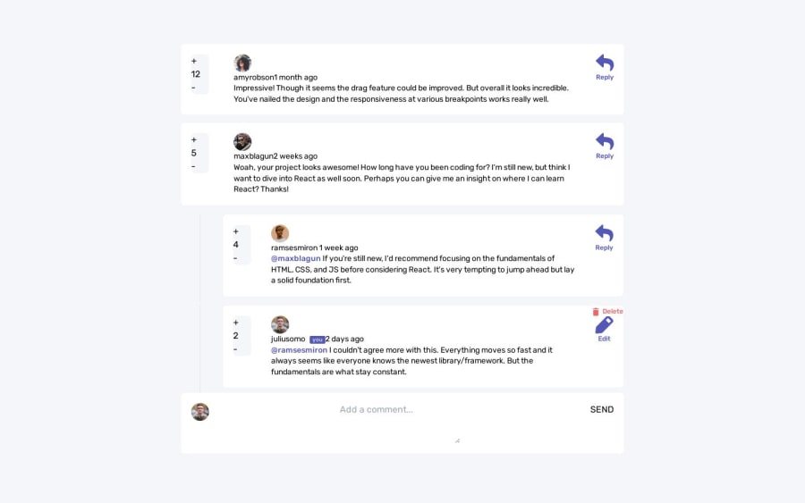
Interactive Comments Component with React & Redux
Design comparison
Solution retrospective
I need help with the following items: 1. The user notice while clicking on the Reply button, it opens a form for every comment and it doesn't make sense. 2. Also the user notice while clicking on the Edit button, it opens a form for every reply and it doesn't make sense.
Community feedback
- @ttsoaresPosted over 1 year ago
Yes, the dialog is required but it seems to me a bit difficult to interact with the yes/no buttons as they are small and not really differentiated : NO.CANCEL YES.DELETE. Also, there is a typo: "...can't ne undone."
0 - @ttsoaresPosted over 1 year ago
Great job ! Specially using Redux... I'm learning Zustand trying to avoid all that boilerplate needed with Redux. A suggestion is to improve the delete comment dialog window. There is a typo there and the YES/NO buttons are not giving a good UX to use...
0@MohamedIbrahim13Posted over 1 year ago@ttsoares Thank you for helping! But the Delete comment dialog is required. Can you explain more what you mean?
0
Please log in to post a comment
Log in with GitHubJoin our Discord community
Join thousands of Frontend Mentor community members taking the challenges, sharing resources, helping each other, and chatting about all things front-end!
Join our Discord
