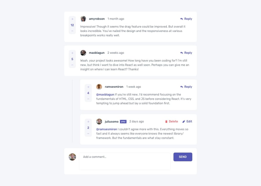
Design comparison
Solution retrospective
I haven't properly learnt how to use JSON yet which made my JS code longer than it should have been. Would love recommendations to good JSON tutorials. Your feedback is highly appreciated!!!
Community feedback
- @shashreesamuelPosted over 2 years ago
Good job completing this challenge
Keep up the good work
Your solution looks great however I think that the background is supposed to be white instead of an image.
In terms of accessibility issues, simply wrap all your content between the semantic main tags. This will help with resolving all of your accessibility issues
In terms of your validation errors, use
<divinstead of<sectionsince it does not serve any purpose within theroleattribute.I hope this helps
Cheers
Marked as helpful0@Keith-Web3Posted over 2 years ago@TheCoderGuru Thanks a lot for the feedback. I used an image as the background because the plain background looked pretty dull to me, I might remove it later though.
Also, I already wrapped my content in the main tag and I used divs instead of sections. I'm not familiar with the role attribute you spoke of so I'll make my research on that.
Thanks again for your feedback, I really appreciate it.
0
Please log in to post a comment
Log in with GitHubJoin our Discord community
Join thousands of Frontend Mentor community members taking the challenges, sharing resources, helping each other, and chatting about all things front-end!
Join our Discord
