Submitted over 2 years ago
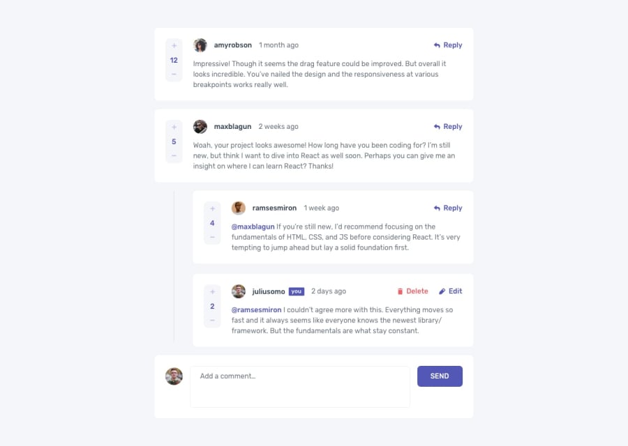
interactive comment section with messy javascript
@JimmyHoang296
Design comparison
SolutionDesign
Solution retrospective
My friend said to me: "Done better than perfect" So here it is, my first intermediate solution. I have a lot of problem with it:
- messy JS code, bad managing function, I think I should group some function to make it more readable
- still not know how to move the cursor to the end of comment box,
any advice would be valuable to me. Thank you.
Community feedback
- @arshGoyalDevPosted over 2 years ago
There are a lot of issues in the app:
- When I add a comment, the added comment layout is messed up.
- When I try to reply to a comment, the comment content is in all blue (only username should be in blue),
- I can't add a reply to a reply- The user should be allowed to upvote a comment only once,
- And after I add a comment and try to upvote or downvote other comments it doesn't work.
- You should remove all of the
console.log()in the js file.
All the other features are working well, and it would be nice if you add some animations
Marked as helpful0
Please log in to post a comment
Log in with GitHubJoin our Discord community
Join thousands of Frontend Mentor community members taking the challenges, sharing resources, helping each other, and chatting about all things front-end!
Join our Discord

