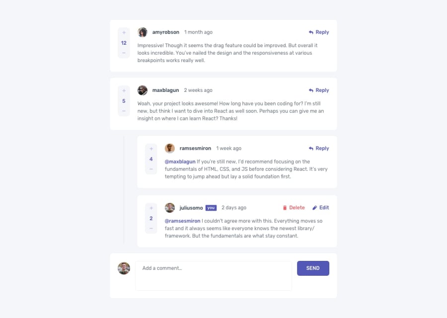
Design comparison
Solution retrospective
Hey! This is one of my first projects with firebase, so there are probably still a few errors I have to workout. I´m still learning how React apps should be organized, and near the end of this project I realized I had made many mistakes when I created each component. So I would really appreciate any feedback related to react and how the data flow should be organized. Thanks!
Community feedback
- @mattstuddertPosted almost 3 years ago
Excellent work on this challenge, Maria! I really like how you've adapted it and made it your own. One area I'd recommend reviewing is using buttons to trigger actions like replying and deleting comments. If you expect a user to interact with an element to trigger an action, it needs to be an anchor tag or button to ensure it's accessible to anyone not using a mouse/trackpad.
I hope that helps. Keep up the awesome work! 👍
Marked as helpful1@mariapenaaPosted almost 3 years ago@mattstuddert Thank you for the advice! I didn't know about this so it I really appreciate it!
0 - @NaveenGumastePosted almost 3 years ago
Hay ! Good Job Maria
These below mentioned tricks will help you remove any Accessibility Issues
-> Add
Main
tag after body like it should be your container. For 1st heading orh1
tag, use header tag and then inside the header put yourh1
orh2
etc . But use header tag only once in main heading element.Keep up the good work!
Marked as helpful1@mariapenaaPosted almost 3 years ago@Crazimonk thank you! I appreciate the feedback and will be sure to include the recommendations.
1
Please log in to post a comment
Log in with GitHubJoin our Discord community
Join thousands of Frontend Mentor community members taking the challenges, sharing resources, helping each other, and chatting about all things front-end!
Join our Discord