
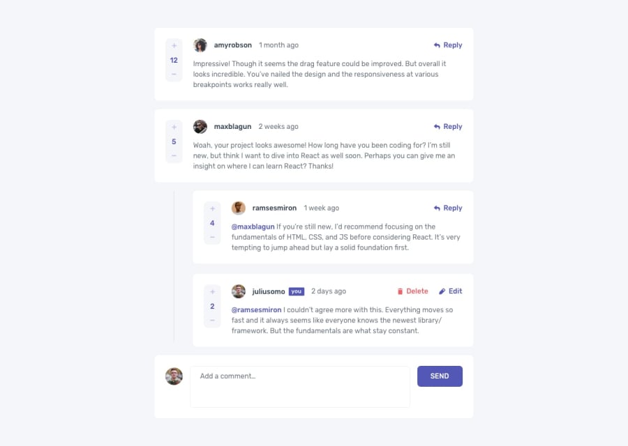
Interactive Comment Section w/ Typescript & React


Design comparison
Solution retrospective
What drew me towards taking this challenge was the opportunity to practice my skills to eventually get confident enough to build a social media clone project. I do not think I am there yet as I am still learning new things about frontend development.
I did struggle to decide if I should/should not use the State hook to record the reply data for each Comment component.
Any feedback would be greatly appreciated.
Community feedback
- @mehmetakifakkusPosted over 1 year ago
Congratulations finishing this task,
I will divide my comments into 2 parts namely visually and functionally.
Visual comments:
-
For the comment-card class on your css file, you can make mode padding from top and bottom by typing this:
padding: 25px 20px. It will put more spaces to the top and bottom, and it will be much similar to the design. -
Instead of making score board centered, according to the design all of them seem starting from the top, so you can change your css
.comment-cardas this:align-items: baseline; -
For your send button inner text color (it is black rn.), you can style in your
.adder-sendclass by addingcolorattribute:color: white -
You can also add hover effect as pointer in your
.edit-button spanclass:cursor:pointer
Functionality and code All functionalities are working perfectly, but I have some advice for your code base.
-
          createdAt={items.createdAt}
          score={items.score}
          user={items.user}
          replies={items.replies}```
instead of passing parameters separately, you can only sent
itemsascomment, then you can destructure it in the child componentconst {score, user, replies} = comment- Another useful thing I can say is that you can use Context API to centralize storage and use whenever you need it.
Take care and happy coding
Marked as helpful1@PatrickLee22Posted over 1 year ago@mehmetakifakkus Thank you for your feedback and taking the time to review my solution.
I was surprised that the SEND button's text was black in the screenshot, and for you by the sounds of it. The text has been white from my perspective.
0 -

Please log in to post a comment
Log in with GitHub
Join our Discord community
Join thousands of Frontend Mentor community members taking the challenges, sharing resources, helping each other, and chatting about all things front-end!
Join our Discord