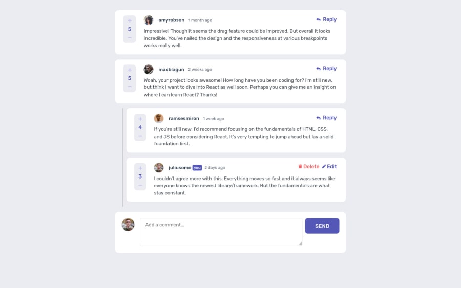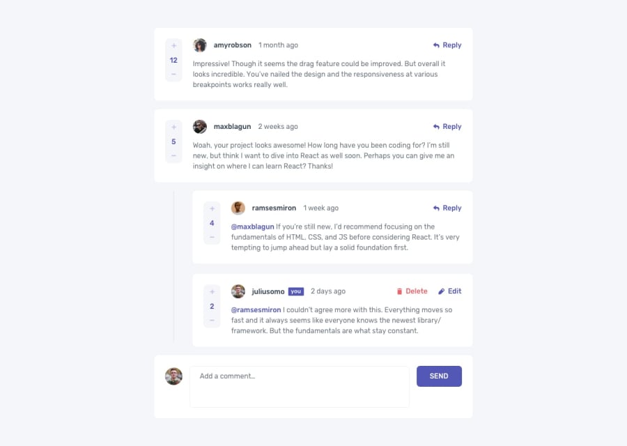
Design comparison
SolutionDesign
Community feedback
- @ccreusatPosted over 2 years ago
Hello !
- Everything @besttlookk said is super helpful!
I will add some stuffs to improve :
- reply to a comment should open the right input below the comment, not in the same view used to write a comment
- I'm not sure about the
stickyposition for the current user input. It's a bit weird on responsive. - Maybe put a fixed width to the upvote/downvote component. Behavior is a little weird
- On
.comments-containerI would go for amax-widthrather than putting awidth. It behaves better
Hope this helps !! Keep coding ! =)
Marked as helpful0 - @besttlookkPosted over 2 years ago
Hi,
- You have lots of HTML issue and Accessibility issue. Go through the report to remove those.
- Currently im not able to downvote.
- On clicking edit.Previous text should be prefilled in the textarea. Currently its not.
- I am not able to add reply also
- User should not vote on its own comment.
Good luck
Happy coding
0
Please log in to post a comment
Log in with GitHubJoin our Discord community
Join thousands of Frontend Mentor community members taking the challenges, sharing resources, helping each other, and chatting about all things front-end!
Join our Discord
