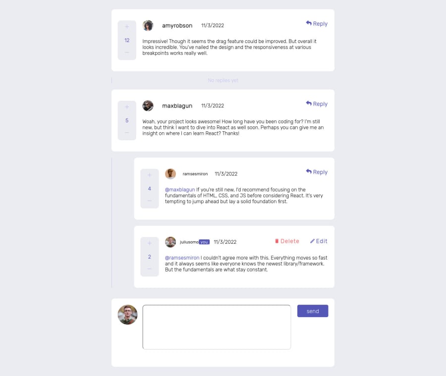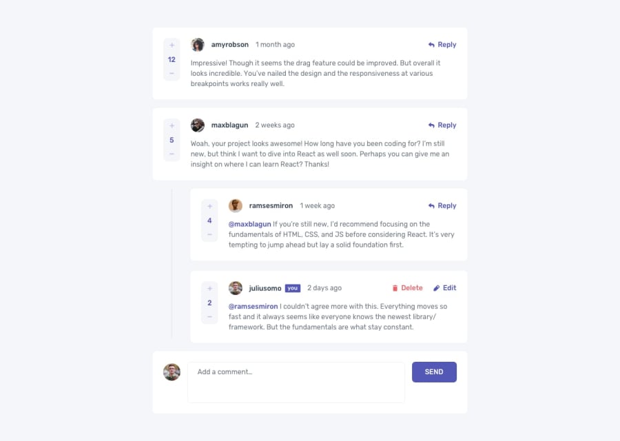
Design comparison
Solution retrospective
Hi people, I had a lot of fun building this project. I built it with react and style it with sass. I also managed state with useContext and useReducer hooks and learnt a lot about them especially how they render components. I feel there are still improvements to make tho. Thanks for checking it out, I will really appreciate your feedback about the functionalities. Happy coding, XOXO.
Community feedback
- @denieldenPosted over 2 years ago
Hi Olasunkanmi, great work on this challenge! 😉
Here are a few tips for improve your code:
buttonmust have discernible text, you can add text with classhidden- to make it look as close to the design as possible add
justify-content: start and gap: 1remto.comment > section:first-child .comment_headerclass - not use
h1for the name of author of comment - instead of using
pxtry to use relative units of measurement -> read here - if I click on the upvote
buttonI can increase it to infinity and not just by 1 point. add a control - i can comment also with empty comment or with blanks, add a control... The
trim()method can help you -> read here
Overall you did well 😁
Hope this help and happy coding!
Marked as helpful1@SiR-PENtPosted over 2 years ago@denielden thanks a lot. I will read and work on things you wrote about. Thanks again.
1
Please log in to post a comment
Log in with GitHubJoin our Discord community
Join thousands of Frontend Mentor community members taking the challenges, sharing resources, helping each other, and chatting about all things front-end!
Join our Discord
