Design comparison
Solution retrospective
This one was a tricky for me, had to google a lot. If theres any way i can improve it pls let me know. Thank u
Community feedback
- @ibra-sanPosted about 2 years ago
Hey! Congrates on completing the projects. Superb job!
Haha I need to take some few points from you myself. If would allow me to be a bit nit picky, then this would be my only suggestion.
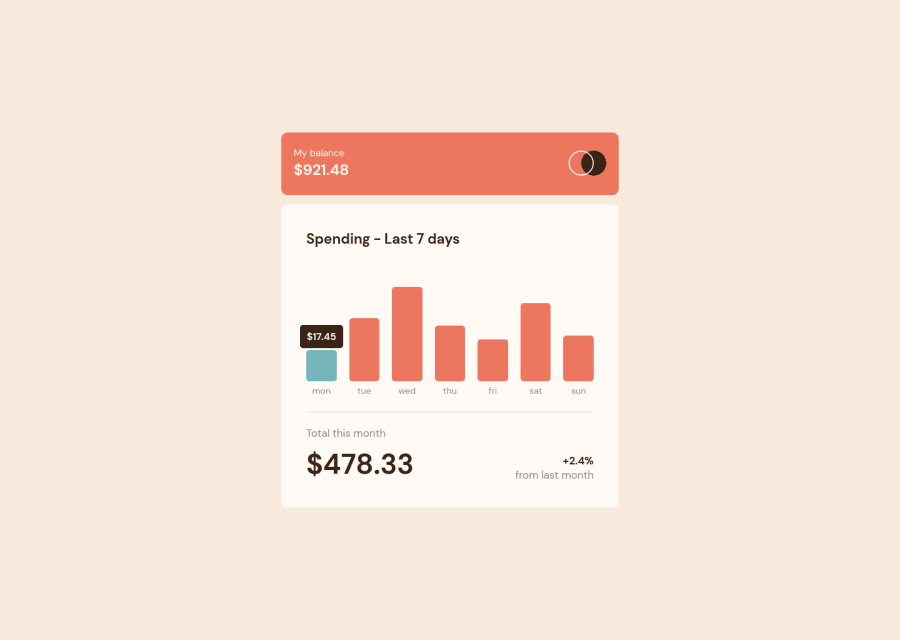
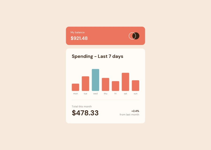
- The bar should be green color depending on the day of the week, not on the cursor click. For instance if today is Monday then once the page is loaded the bar representing today should be colored green indicating the expenditure of today. This could be achieved by getting which day of the week is it using the date function in JS. See if todays day matches the names of the day in your HTML. If it does then change the background to green, else leave it as normal.
This suggestion is after serious nit picking. Congrates man on a superb job and have a nice day.
Marked as helpful1 - @elaineleungPosted about 2 years ago
Hi Joel, I think this was really well done, and good job building it with React. Just to follow what Ibramhim mentioned, right now you got the Monday bar colored and also with the tool tip amount showing. The tool tip tag is meant to be shown when hovered over, just like how the bar color change when hovered over; in other words, when you hover over the bar, two things happen: the color changes to a lighter one, and the tool tip appears. Other than this, I think everything looks good; the font size in desktop view just needs to be bigger and some more padding can be added, and that would look closer to the original. Great work on the whole! 😊
Marked as helpful0
Please log in to post a comment
Log in with GitHubJoin our Discord community
Join thousands of Frontend Mentor community members taking the challenges, sharing resources, helping each other, and chatting about all things front-end!
Join our Discord
