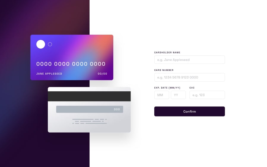
Design comparison
Solution retrospective
Q1: Scaling elements with "fixed" Children
One aspect of the project I wasn't able to figure a satisfying solution for was how to scale the credit card images down and keep the fixed fonts in proportion to the image. I ended up with 2 static sizes instead of doing a smoother transition between them.
Q2: Masking inputs credit card info
I was looking for a library to do the masking for the credit card number inputs. I couldn't find one very quickly so I ended up using a regex solution instead. It's not very satisfying as it doesn't apply to the input itself, and allows users to input the spaces instead of automatically handling that for them.
Q3: Working with angular
Would it have made more sense to split this page up into separate components and services? Once finished, I thought it would be appropriate to break pieces up so that they could be re-used across other theoretical parts of a UI. Similarly, breaking up the scss sheets would make it easier to read and apply them to their specific components.
Community feedback
Please log in to post a comment
Log in with GitHubJoin our Discord community
Join thousands of Frontend Mentor community members taking the challenges, sharing resources, helping each other, and chatting about all things front-end!
Join our Discord
