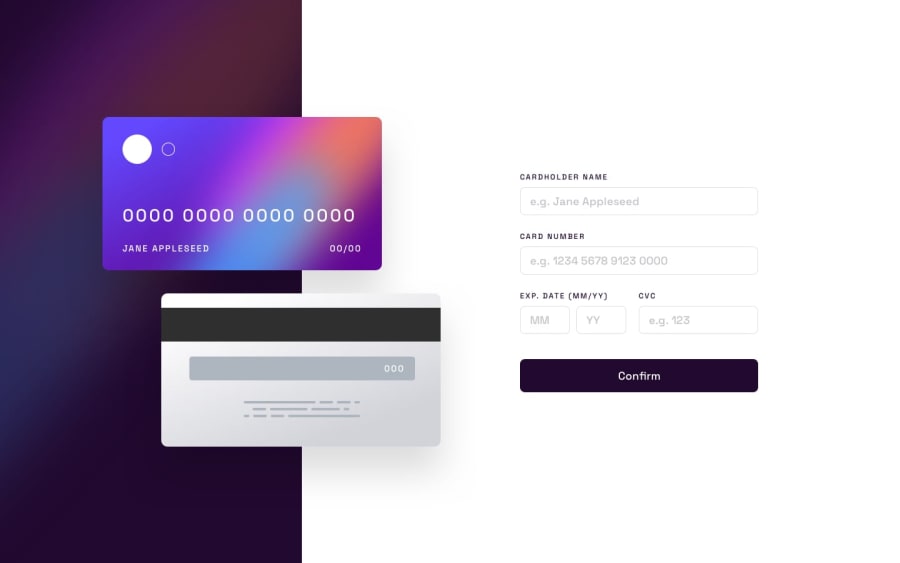
interactive card with react typescript and extras
Design comparison
Solution retrospective
used grid for easy positioning, extra validation and animations for a little polish with a sprinkle of regex
Community feedback
- @sjoseph91Posted over 2 years ago
Hey, I like your animations. They are subtle, yet effective. I also learned that about the html autocomplete input attribute from your code. That would have been useful in my app since we don't want our real credit card data going into these apps.
This may be nitpicky, but the month validation still allows you to put dates in the past. I manually put in a regex where the string had to be greater than 22, but if you wanted it to be flexible, you could use the new Date() and getMonth method to find the current month and make your users enter dates after that month.
Thanks for reading and all the best!
Marked as helpful0
Please log in to post a comment
Log in with GitHubJoin our Discord community
Join thousands of Frontend Mentor community members taking the challenges, sharing resources, helping each other, and chatting about all things front-end!
Join our Discord
