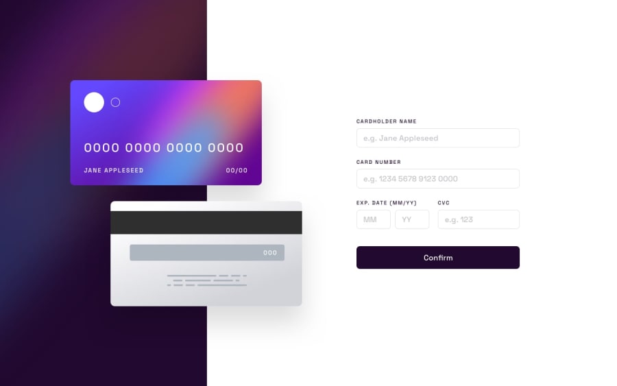
Design comparison
SolutionDesign
Solution retrospective
What would be a better alternative to position the card images other than 'position: absolute' ? All feedbacks are welcomed, Thank you!
Community feedback
Please log in to post a comment
Log in with GitHubJoin our Discord community
Join thousands of Frontend Mentor community members taking the challenges, sharing resources, helping each other, and chatting about all things front-end!
Join our Discord
