Design comparison
SolutionDesign
Solution retrospective
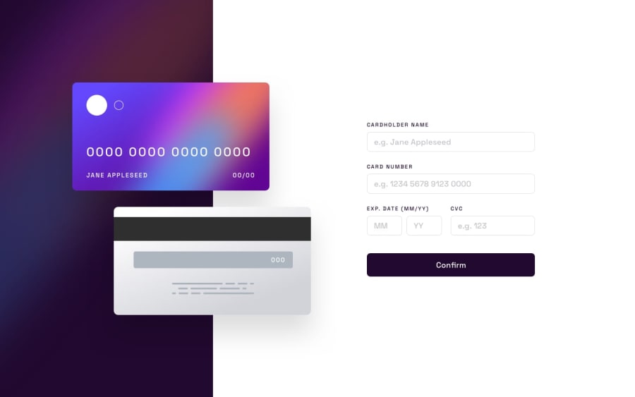
I am really struggling with this one. I can make it look good in 2 screen configs... and that is it. If you change the screen resolution the layout breaks. I would appreciate some help in this one.
Community feedback
- @naida1210Posted about 2 years ago
Hi Octavio ! Congratulations on finishing your first project! It looks amazing. The only thing I see is name and expiration information positioned outside of card visually. To fix that you can give position : relative to parent element and position : absolute to its child element. For example :
parent { position : relative; }
child {
position :absolute ; bottom : 30px; }Hope it helps.
Marked as helpful1
Please log in to post a comment
Log in with GitHubJoin our Discord community
Join thousands of Frontend Mentor community members taking the challenges, sharing resources, helping each other, and chatting about all things front-end!
Join our Discord
