

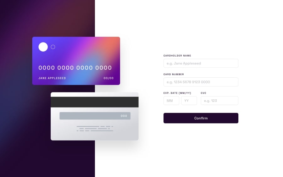
Design comparison
SolutionDesign
Solution retrospective
What are you most proud of, and what would you do differently next time?
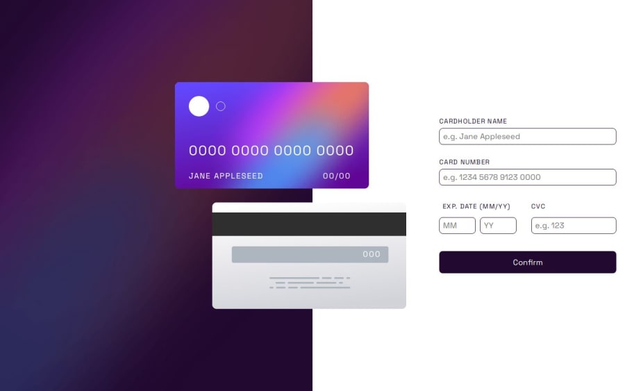
the cards.
less procrastination
What challenges did you encounter, and how did you overcome them?getting the cards in the right place: I searched on youtube for videos about positioning and got really lucky, because kevin powell had a video about responsive positioning using this project.
preventing the form from submitting before checking if the correct info has been added: search google and found out about event.preventDefault()
What specific areas of your project would you like help with?what font size and img size should I use for widths less than 375px? Because I ended up running out of space for them so the edges end up touching. I tried padding, but it did not work the way I wanted
Community feedback
Please log in to post a comment
Log in with GitHubJoin our Discord community
Join thousands of Frontend Mentor community members taking the challenges, sharing resources, helping each other, and chatting about all things front-end!
Join our Discord