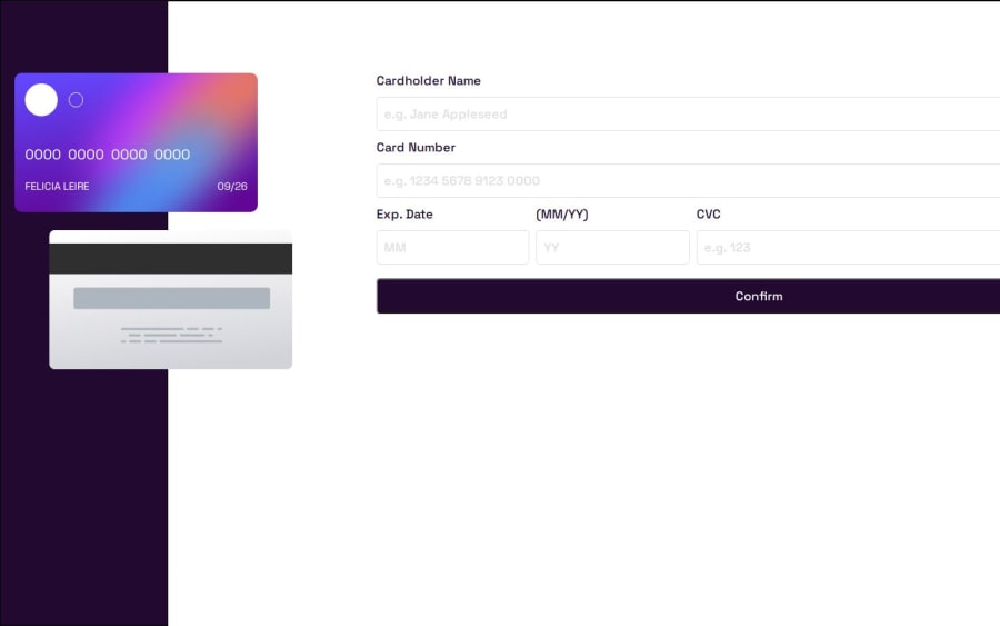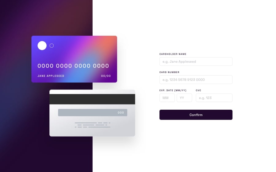
Design comparison
SolutionDesign
Solution retrospective
What are you most proud of, and what would you do differently next time?
This is just an initial upload to see how far off the design I am as I dont have the figma files yet and also to seek advice on dealing with the overlapping cards. I also have not added the js funtionality just yet.
What specific areas of your project would you like help with?Any tips for the styling, specifically the overlapping card look. I feel I am relying too much on positioning it where I want using margins etc.
Community feedback
Please log in to post a comment
Log in with GitHubJoin our Discord community
Join thousands of Frontend Mentor community members taking the challenges, sharing resources, helping each other, and chatting about all things front-end!
Join our Discord
