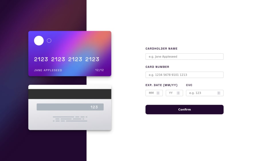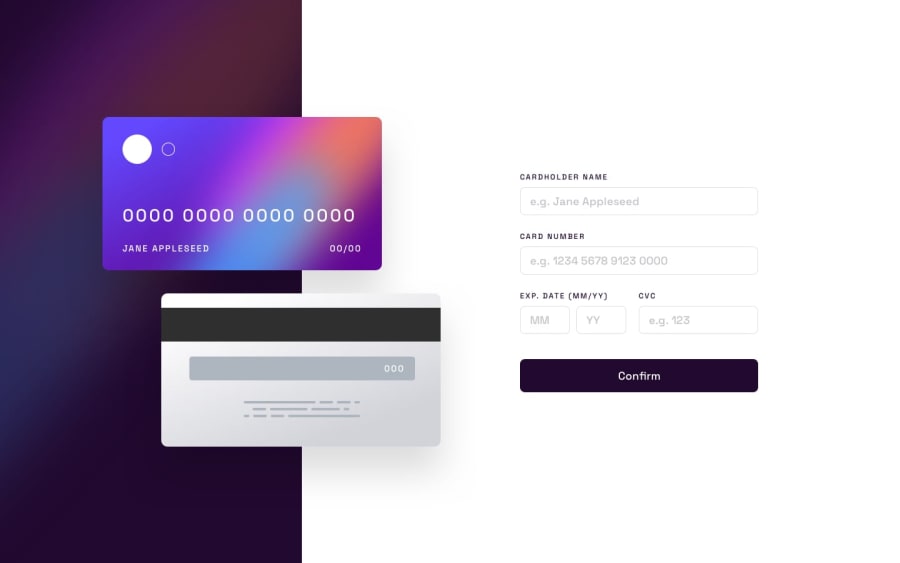
Design comparison
Solution retrospective
Hiii people.
Oh boooy, this was fun! I learned a lot of thing. I've made a couple of mistakes and spent some time stuck in certain things - like animation and forms lol - but i'll try to address them asap.
I know that react has a lot of libraries to handle forms and stuff, but i wanted to try my best with pure react, i used different approaches, like using objects to structure the inputs and high order components.
I'm not sure that my take on validating forms is correct and safe, i used require attr and patterns to make sure that my inputs were correct and then used onSubmit to validate it all in one take
//input example that will be mapped into jsx
inputs = {
    name: {
      name: "name",
      value: data.name,
      type: "text",
      id: "name",
      placeholder: "e.g. Jane Appleseed",
      required: true,
      pattern: "^[ a-zA-Z ]*$", //anything else will mark this input as invalid
    },

const handleSubmit = (e) => {
    e.preventDefault();
    //in my tests, the event obj will only have an type submit if its inputs were all valid
    if (e.type === "submit") setIsGoingToContinue(true);
    if (isGoingToContinue) setIsGoingToContinue(false); //just a hack to return to form screen
  };

//form
<form className="forms" onSubmit={(e) => handleSubmit(e)}>
I would love feedback and critic's <3
Community feedback
- @elaineleungPosted over 2 years ago
Hi Lucas, well done building this out in React! I like what you did with the animating cards, and I think on the whole this was a job well done! About the validation, I think what you did with the RegEx is OK; I do have some suggestions about fine-tuning some of the things here in validation:
-
For the credit card input, see whether you can limit the input to just 16 digits so that the user won't be able to input anything past that
-
For the date input, right now I can enter an old month and year, and that would still pass through; see whether you can only allow users to put in a future year/month.
-
For the messages, in a real world setting you'd definitely want them to start with a capital letter to look more professional
One more suggestion I have is for the view on smaller screens; the cards are a bit close to the first text line, and so I would put some more spacing there. I see you using a
10vwfor your top padding; the issue with using viewport units sometimes is that they can get a bit out of hand if you don't set a limit. You can try usingmin()for that and set something likewidth: min(15vw, 4rem)instead, where the browser would choose the smaller value of 15vw or 5rem.Once again, great job here 😊
Marked as helpful1@LukiticasPosted over 2 years ago@elaineleung Thanks for commenting, Elaine <3. Yep, i was studying relative units in css and tried to apply them in this project but it got out of hand, i will refactor the whole css throughout my studies, your advice will be of great help. About the input limit, setting them to 16 digits was my first take, but i thought it might be a bad experience for the user, as i get a little frustrated when inputs limits my characters , so i ended up only showing them an error after x digits.
1@LukiticasPosted over 2 years ago@elaineleung One more thing, please. This date issue that you highlighted, how could i address it? Because of how the input is set up, i can only take 2 digits, its easy to validate the mouth input, because it has a fixed range from 1 to 12, the problem is with the year's input, 20 can mean a lot of dates, 20"20", 30"20", "20"30, should i hard code a max and min value?
0@elaineleungPosted over 2 years ago@Lukiticas I think you can just use a new Date object in JavaScript, which is how I would do it. You can check out this forum question here on FreeCodeCamp, and for a real live example, check out Simon's solution to this challenge; he used Vue for his solution, but I think in terms of the functionality, this could still give you some idea on how it could work. Good luck!
1 -
- @correlucasPosted over 2 years ago
👾Fala Xará, tudo bem? Parabéns pelo desafio!
Linda solução, agora vc só ta fazendo essas soluções mais complicadas, e humilhando os noobs como eu hahaha faz alguma mais fácil brother, me ajuda a te ajudar.
Zoeira, parabéns Lucas, vc tem mandado mto bem, to acompanhando as ultimas e o trabalho está o fino do fino.
👋 Continue no foco!
1@LukiticasPosted over 2 years ago@correlucas Obrigado Luquinhas! Bah, ainda to longe de me comparar a você, vc é muito bom, um dos melhores aqui do site, seu trabalho é uma inspiração para mim.
1
Please log in to post a comment
Log in with GitHubJoin our Discord community
Join thousands of Frontend Mentor community members taking the challenges, sharing resources, helping each other, and chatting about all things front-end!
Join our Discord
