


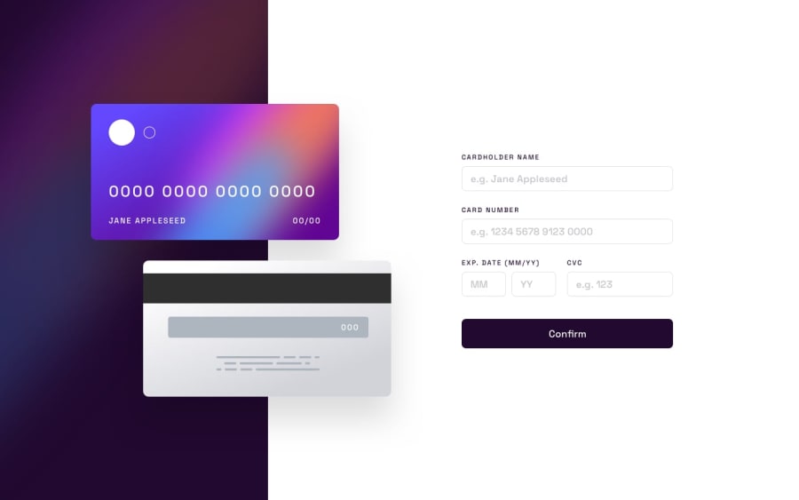
Design comparison
Solution retrospective
application has only one bug when cardholder name filed is fill after confirm the form program continue work... what ever filed work perfect and resposnive works only 930px
Community feedback
- @ozzy1136Posted about 2 years ago
Take a look at CSS media queries: https://developer.mozilla.org/en-US/docs/Web/CSS/Media_Queries/Using_media_queries. You can update styles based on how large the viewport width is. For your project, you can use a media query to make the divs stack vertically on small viewports and then lay horizontally on large viewports.
.wrapper {
  flex-direction: column;
}
@media screen and (min-width: 930px) {
  .wrapper {
    flex-direction: row;
  }
}
Also, make sure to place all the main content of the page inside <main></main> elements. For your project, you can change
<div class="wrapper">into<main class="wrapper">or you can place the div inside a <main> element. Take a look at this reference for HTML sectioning elements: https://developer.mozilla.org/en-US/docs/Web/HTML/Element#content_sectioning.0

Please log in to post a comment
Log in with GitHub
Join our Discord community
Join thousands of Frontend Mentor community members taking the challenges, sharing resources, helping each other, and chatting about all things front-end!
Join our Discord