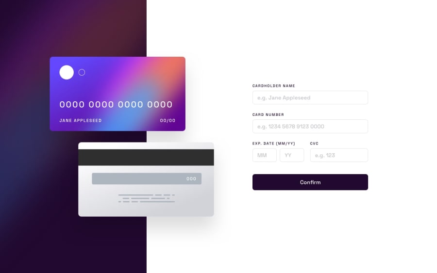
Design comparison
SolutionDesign
Solution retrospective
Would appreciate any feed back!
I positioned the cards absolutely to the bg container, wondering if maybe putting it in a grid with the form would have been a better approach. Please let me know what you think
Any other criticism would be appreciated, struggled a bit with this project but am happy with how it turned out
Community feedback
Please log in to post a comment
Log in with GitHubJoin our Discord community
Join thousands of Frontend Mentor community members taking the challenges, sharing resources, helping each other, and chatting about all things front-end!
Join our Discord
