Submitted over 2 years ago
Interactive card form using Vite, React and Tailwind
#tailwind-css#vite#react
@warrenlee
Design comparison
SolutionDesign
Solution retrospective
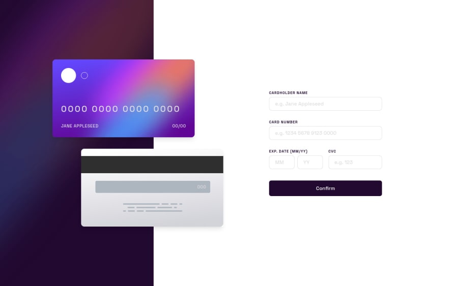
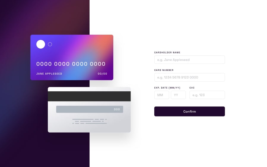
The layout of this challenge was quite tricky and the level of this could arguably be more intermediate level. Working with forms is usually a nightmare but I got there in the end. My form uses Formik and uses Yup for validation. Please 4242 4242 4242 4242 as the card number to pass validation.
Thanks!
Community feedback
- @AbcmahPosted over 2 years ago
great work. you are the best in this challenge so far, your layout and alignments of the components are identical to the ones on the challenge's design
1 - @Deevyn9Posted over 2 years ago
This is really great Warren, your layout and arrangement is really interesting. Keep going
1
Please log in to post a comment
Log in with GitHubJoin our Discord community
Join thousands of Frontend Mentor community members taking the challenges, sharing resources, helping each other, and chatting about all things front-end!
Join our Discord
