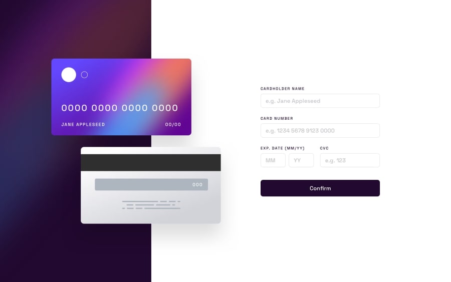
Design comparison
Solution retrospective
Hey everyone! I really enjoyed this challenge!
What I found difficult was aligning the cards as per viewport breakpoints. In the end I settled for establishing few viewport breakpoints because adjusting the absolute position of all the elements and making sure they fit perfectly would be a big undertaking and one I found myself getting cheesed off with pretty quickly! And so if the page breaks, it's likely because I didn't cater to that viewport. Everything seems to work well on mobile but struggles towards desktop.
How would you guys implement the design?
Let me know what you think of mine :) Thanks!
Community feedback
Please log in to post a comment
Log in with GitHubJoin our Discord community
Join thousands of Frontend Mentor community members taking the challenges, sharing resources, helping each other, and chatting about all things front-end!
Join our Discord
