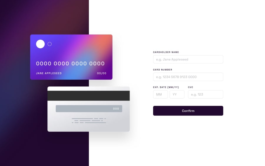
Design comparison
Solution retrospective
Javascript was not too difficult for the interactive part, but the custom error messages and validation was more challenging.
What challenges did you encounter, and how did you overcome them?I am not super confident that the positioning of the cards is according to responsibility/accessibility guidelines, but it works 🤷🏼♀️
What specific areas of your project would you like help with?Also it would have made more sense to submit to a new HTML page after pressing the button, but the card details should appear correct on that page as well and that seemed fussy, difficult.
Community feedback
- @Zy8712Posted 8 months ago
Your site looks great!
The only thing I'd maybe add in is the
maxlengthattribute for the input boxes so users are more restricted as to the numbers they can type in.Aside from that your code is well formatted and easy to follow. Nice work 👍
1@BekiaDPosted 8 months ago@Zy8712 Hi! maxlength apparently is ignored by design with number inputs. I tried to use min and max attributes, but for one reason or another my code just did not care, it would have made my code so much easier if it worked :( Thank you for checking my work, I appreciate it!
0
Please log in to post a comment
Log in with GitHubJoin our Discord community
Join thousands of Frontend Mentor community members taking the challenges, sharing resources, helping each other, and chatting about all things front-end!
Join our Discord
