Design comparison
SolutionDesign
Solution retrospective
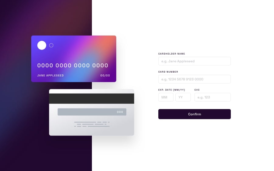
Tried my best to make it look the best on all screen sizes. Don't know about 2xl screens as I finished this on my laptop which had an xl screen.
Learned a lot about styling in tailwind and how to use the different screen size selectors to make the app responsive.
Also learned more about the validation method for each input. I only had practice validating one input field before, where this project had 5 input fields.
There is probably work that could be done to optimize the code such as mapping the inputs, but I wanted to move on to a different project.
Any tips would be appreciated.
Community feedback
Please log in to post a comment
Log in with GitHubJoin our Discord community
Join thousands of Frontend Mentor community members taking the challenges, sharing resources, helping each other, and chatting about all things front-end!
Join our Discord
