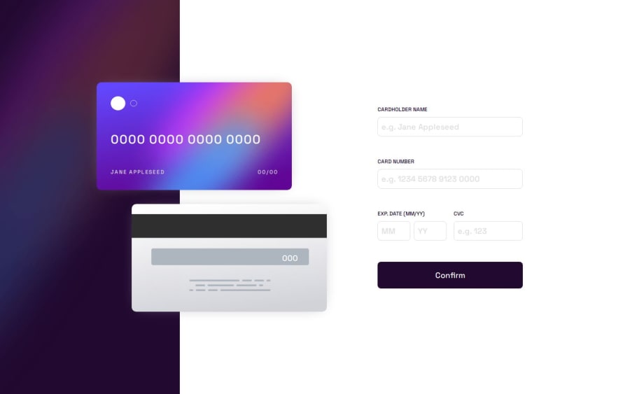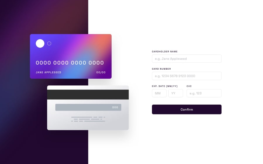
Interactive Card Details using Flexbox, Grid and Vanilla JS
Design comparison
Solution retrospective
The way I do the validation makes it easy to insert new validation but the code may be a bit messy. I hope to be able to improve upon it in the future and come up with better solution on my own next time.
What challenges did you encounter, and how did you overcome them?Since I do the validations the way I did, I didn't know how to validate the expiry date since they share error state. But it was a silly mistake I overlooked that cost me precious time.
So, I added a second function to validate just the two input fields.
What specific areas of your project would you like help with?I'm unsure about my CSS and JS. I feel like they're inefficient for what may be a simple challenge. But my lack of skills made it hard for me.
If you have any pointers I could use, please do share with me. Thank you!
Community feedback
Please log in to post a comment
Log in with GitHubJoin our Discord community
Join thousands of Frontend Mentor community members taking the challenges, sharing resources, helping each other, and chatting about all things front-end!
Join our Discord
