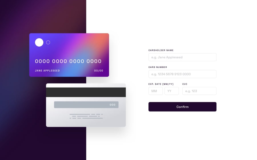
Design comparison
SolutionDesign
Solution retrospective
Challenge was harder than i thought at the beginning, the most difficult part was properly styling the card front and back to look good at mobile devices too (still looks bad). Added a bit more complex validation than was described in the brief (number, cvv, month, not-empty). Overall interesting challenge.
Community feedback
Please log in to post a comment
Log in with GitHubJoin our Discord community
Join thousands of Frontend Mentor community members taking the challenges, sharing resources, helping each other, and chatting about all things front-end!
Join our Discord
