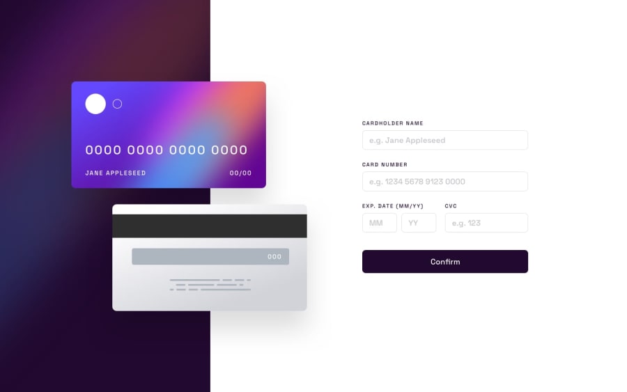
Design comparison
SolutionDesign
Solution retrospective
Floating credit card visualisation was a challenge, especially with the responsive design and data fields to be in correct places.
JS script took me some time and I had to rewrite it once or twice. It surely could be done in a nicer way. I'd be happy to hear Your comments on how to imporve form validation.
Community feedback
Please log in to post a comment
Log in with GitHubJoin our Discord community
Join thousands of Frontend Mentor community members taking the challenges, sharing resources, helping each other, and chatting about all things front-end!
Join our Discord
