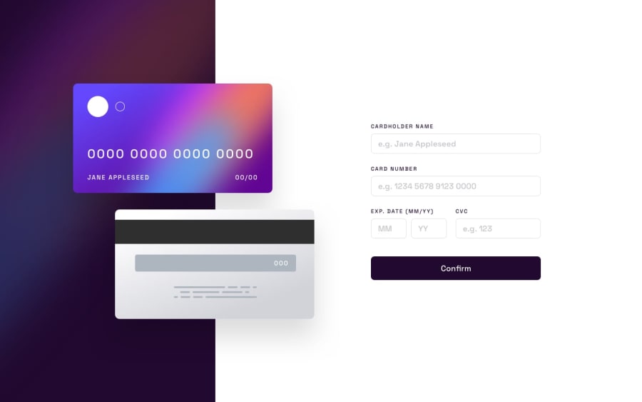
Design comparison
Solution retrospective
Please me on where to improve. I will gladly appreciate your response.
Community feedback
- @Lucifer8537Posted about 1 year ago
First of all, loved your animation on the web app start. I think you should handle the form input: The user should only be allowed to enter alphabets in the name field. You should restrict the card input field to 16 digits.(Make it mandatory that the user has to enter 16 digits or give an error on confirm). Only valid dates should be allowed. You can check the dates on the continue button click. cvv should only be of 3 digits. Other than that loved your web app. You just need to work a little on functionality.
Marked as helpful0@Babsman123Posted about 1 year agoThanks so much on your review, really appreciate. Will work on them now.@Lucifer8537
0
Please log in to post a comment
Log in with GitHubJoin our Discord community
Join thousands of Frontend Mentor community members taking the challenges, sharing resources, helping each other, and chatting about all things front-end!
Join our Discord
