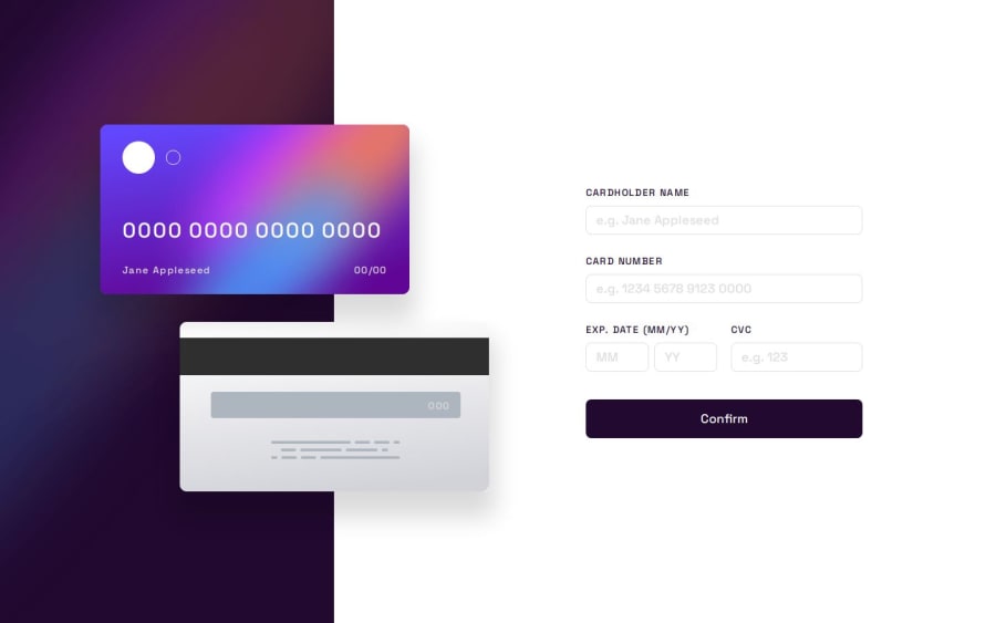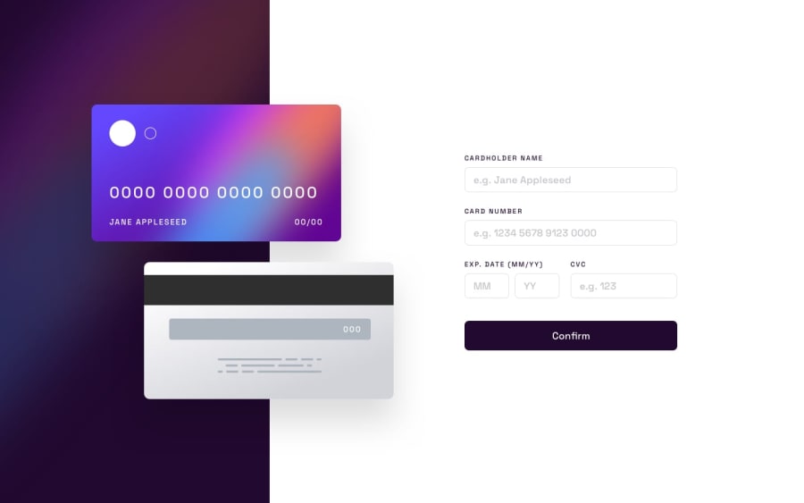
Interactive Card Details Form
Design comparison
Solution retrospective
I'm proud of the fact that I utilised well known tested libraries to complete the project.
I used:
- ChakraUI: a simple, modular and accessible component library to achieve the design.
- Formik: Form Library for React and React Native to manage my form validation, state and errors.
- Yup: Schema builder for runtime value parsing and validation to define my validation rules for each field in the form
I never used these tools before so I had a tough time linking them up and getting familiar with them. I had to consult the docs a lot and look up a lot of articles but it was really worth it.
Comparing when I was doing form validation myself. using these tools really made it more easy but also more organised and more reduced code.
What specific areas of your project would you like help with?I would like to know if my code is readable, understandable and follows best practices.
Of course any feedback is welcomed.
Thank you for viewing my solution!
Please log in to post a comment
Log in with GitHubCommunity feedback
No feedback yet. Be the first to give feedback on Abouelhouda Iliass's solution.
Join our Discord community
Join thousands of Frontend Mentor community members taking the challenges, sharing resources, helping each other, and chatting about all things front-end!
Join our Discord
