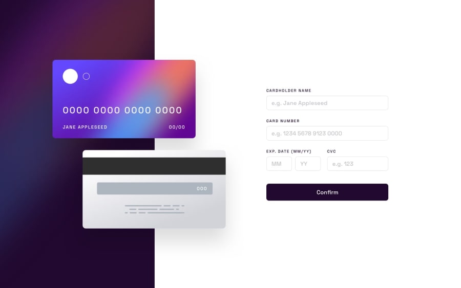
Design comparison
SolutionDesign
Solution retrospective
Probably won't be exactly to the challenge design but the challenge was good, and I enjoy it.
Would it have been better to set the main into three sections, one for background color, second for the cards and third for the form and then move the cards positions or is having main in two sections, like I've done fine?
Also was the JS switch statement the best approach to handling the on-change validation? or is there a better approach.
Thanks for taking the time to view and any feedback is always appreciated.
Community feedback
Please log in to post a comment
Log in with GitHubJoin our Discord community
Join thousands of Frontend Mentor community members taking the challenges, sharing resources, helping each other, and chatting about all things front-end!
Join our Discord
