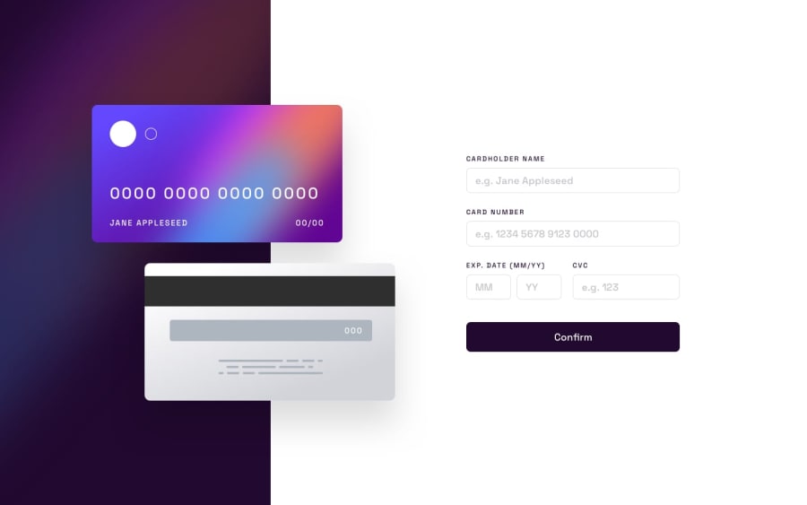
Design comparison
SolutionDesign
Solution retrospective
What are you most proud of, and what would you do differently next time?
This challenge is quite hard for me. I need some suggestions for improvement, please thx. Do I need to use relative, fixed, or absolute? and how to make more efficient script. when mobile resolution how to adjust the height form? so it stand still? or use fixed? i need feedback. Thank You
Please log in to post a comment
Log in with GitHubCommunity feedback
No feedback yet. Be the first to give feedback on Kim's solution.
Join our Discord community
Join thousands of Frontend Mentor community members taking the challenges, sharing resources, helping each other, and chatting about all things front-end!
Join our Discord
