Submitted over 1 year ago
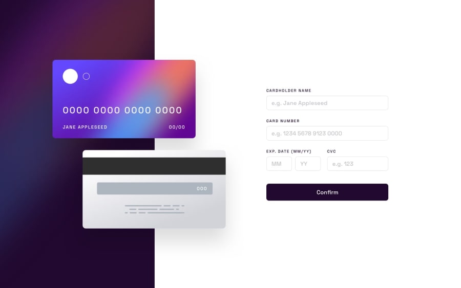
Interactive card details form with Next.js,Typescript and Tailwind
@aleksandr-efimenko
Design comparison
SolutionDesign
Solution retrospective
It was my first time using Tailwind, and I can't say that I really liked it. I feel like I could have spent half the time without it :D
I had trouble creating a border color gradient for inputs. To solve this, I used an inner div with a gradient background and set the padding to 1px for the inner input. However, this solution only works perfectly when the user sets the screen size to 100%. Otherwise, the 'border' appears uneven. If you have a better solution, please share!
Moving forward, I'm open to any advice or suggestions on how I can improve the project.
Community feedback
Please log in to post a comment
Log in with GitHubJoin our Discord community
Join thousands of Frontend Mentor community members taking the challenges, sharing resources, helping each other, and chatting about all things front-end!
Join our Discord
